The History of the Wedding Invitation

A really cool article on Graphic-Design.com by Fred Showker.  I found these tidbits particularly interesting:

  • “Before the printing press, the noble were the only ones who used paper invitations, hand calligraphy crafted by monks skilled in the art.”
  • “You know the reason for double envelopes originated because they were delivered by horse, so to keep the inside invitation and envelope clean, the double envelope standard was created. “

Real Weddings: Tim and Maureen

I’ve mentioned Maureen and Tim’s wedding suite on the blog before, considering the wedding is this weekend, I thought I’d include some pics of the the finished product!

Maureen & Tim's Invitation Suite

A few different views of the invitation suite I created for my brother and (now) sister in law! This was a five part two-color suite assembled within an A9 pocketfold.

Tagged , , , , , , , , , , , ,

A little fall present from me, to me

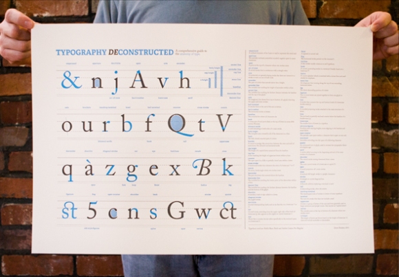
Most letterpress printers (and a lot of brides) probably know all about Studio on Fire, an amazing letterpress and design studio in Minneapolis.  You can check out their site here, and their blog here.  I was going through their designs recently, and came upon this amazing typography poster:Deconstructing Type Poster (Full View)

 
 It’s a beautiful print, artfully registered by Studio on Fire.  I’ve been blessed with a few freelance jobs here and there, so I decided to splurge and buy it for myself as a little “way to go!” present. 

You can purchase it here.  Just don’t read the comments lamenting its price…if you know even the slightest bit about the investment of time and money that goes into letterpress, it’ll drive you mad!  All images from Typography Deconstructed and Studio on Fire.

Tagged , , , , , ,

New (old) things, and a stream of consciousness

I have a tendency to make up stories.  I make them up about someone who’s path crosses mine just once, even if it’s only for a few seconds, and nearly every time the story is sad.  I came up with a story as I visited an old woman’s home the other day. 

Her granddaughter was helping her clean out her house so that she could move, and my assumption is that she was relocating to a nursing home.   The granddaughter took on the daunting task of listing tons of items for sale online, including her late grandfather’s print shop.  And that’s what brought me there. 

She had two presses for sale, along with just about any print shop item you could think of: paper cutters, slug cutters, book presses, type specification books, type, typecases, leading, slugs, dies, paper, envelopes…you name it, it was there.  As I moved around the basement studio where her grandfather used to work, I tried to piece together his life, or at least this part of his life.  I decided that he was a professional printer at one time, but fell on hard times in the late 60s and had to find other work to support his family.    From there, he spent time in the basement solely for enjoyment and solitude.   I imagined him hunched over on a stool, concentrating on setting type, bathed in a lonely flourescent light, unperturbed by the company of a rogue mouse padding across his row of typecases. 

While I was excited at the opportunity to browse and buy some new items for my own little print shop, I felt overwhelmingly sad.  I wondered when his visits to the basement print shop slowed.   And worst of all, as his body started to betray him, if he carefully ventured into his shop just to smell the wood, oil, paper and metal, unable to use them as he used to.   I wondered if he wished that someone in his family had loved letterpress as much as he did, I’m sure he would rather have had it that way than a bunch of strangers rifling through his things. 

It brought to mind that ridiculous line from Varsity Blues “I…don’t…want…your life.”  Maybe he did want his family to embrace letterpress, but it just wasn’t in the cards for them.  No child wants their parent telling them what they should do with their life.  And let’s be honest, just about every dad out there has a hobby or quirk that outsiders just don’t get.  Maybe printing was his.  Everyone has passion, but the tragedy is that not everyone realizes it.  

Enough of my sad stories.  I hope that he’s ok with me using his slug cutter for a while.

Tagged , , , , , , ,

The Story of My Press: The Purchase

I started letterpress printing in May 2009, and as you’ve read in previous posts, I was absolutely hooked.  It didn’t take long before I started dreaming of purchasing a press of my own.  I realize now just how premature that was, especially considering that this was before I even knew about resources like BriarPress or Boxcar, so I went to, you guessed it, Craigslist.  Oddly enough, within a few weeks of casual searches, I found an estate sale in nearby Arlington where they were selling a tabletop press, type and lots of other old letterpress goodies.  On the day of the sale, Jason and I snuck away from work for the afternoon to take a peek, and so, I was introduced to the jarring reality of what it means to have a letterpress studio of your very own. 

We walked into the old house and I scanned the room for the press.  I couldn’t find it anywhere, so I asked a woman who seemed to know what she was doing, and lo and behold, the press and all the rest of it were in the basement!  We walked down the creaky wood stairs and there it was.  I had never seen a tabletop press in person.  Internet searches had made me vaguely familiar with names like Chandler & Price, Kelsey and Adana, but had never seen this kind before.  It was a 3×5 Caxton C&M, a brand I had heard nothing of at the time, and to this day!  It was $900, and naive me was completely ready to buy it.  It was a press, it was right in front of me, and it was less than $1000…how could I let this opportunity pass me by?  Thank God Jason was there and talked me out of it.  I know now that if I had purchased it, I would have pretty much been limited to printing business cards which are nice and all, but I enjoy a little bit of variety.  He dragged me out of there, not before I purchased a dusty old type specimen book that I have to keep in a box outside because it’s mere presence makes me sneeze.  And the search continued.

I wised up just a bit, and started checking the classified section of BriarPress for a tabletop press in the DC area.  Turns out they don’t exist…or didn’t for the 8 months that I searched.  Then I got an iPhone, and checking for presses became an obsession.  I looked constantly, and emailed anyone selling a press from here (Virginia) to the Mississippi.  Months went by and I became more desperate and more determined.  One night in April 2010, Jason and I were watching something on TV (probably Bones because I wasn’t paying attention and instead tweedling away on my phone) and I saw an announcement on BriarPress that their servers had gone done due to massive storms in the Northeast.  Fate made me check again a mere 30 minutes later (it must have been the heavens opening and angels singing that prompted me) and I clicked on a just-listed 6.5 x 10 Chandler and Price Pilot for sale outside of Boston.  I responded as quickly as I could, and then the owner responded.   I was the first, so she would sell the press to me! 

As Jason and I made the long drive from DC to Boston, I truly felt it was meant to be.  I had emailed so many people, responded to so many listings and was always met with the same answer – it’s sold, you’re too late, sorry.  That was becoming  my expectation, I was almost in denial that I was so close to finally having my own press.

When we arrived, it was more than I could have ever expected.  The wife (the letterpresser) told me how when she bought her first press, the generous printer had given her enough equipment to start a fully functional shop, and she wanted to repay the favor.  Believe me, I will do the same when it comes time for me to sell my press.  So they gave me type, furniture, tympan paper, and entire California job case.  It was unreal.  Although it felt like I had reached the finish line, this was only the start of my journey with my new press.

After buying the press, we wanted to take a day to tour Boston. So my new California job case hung out on top of Jason's car in downtown Beantown. You would not believe the looks we got from people on 95 on the way home to DC, you would have thought we had a pink elephant tied to the top of the car!

About to buy a Press?  Here’s a few tidbits:

1.  Contain your excitement.  Don’t let your excitement or wallet get the better of you.  There will be broken presses for sale out there, and their price tags will be very enticing.  Unless you are ridiculously good with machinery and/or tinkering, don’t do it, just don’t.  Believe me when I say that there are few things in this world more frustrating than manhandling a 60-year-old machine into working order. 

Of course it’s your call, but I’d advise against purchasing a press on eBay or any other source where you don’t get to see the press in person or meet the previous owner.  There are just too many variables in this scenario that could go wrong.  Once you find the press that you want at the right price from a reputable seller who knows that it’s in working or close-to-working condition, go for it. 

2.  Presses are old.  Letterpress printing as a profession is quite old, thus, so are the presses.  Most of them are made of cast iron, and believe it or not, cast iron is very fragile.  Fragile and unbelievably heavy.  If you’re purchasing a press, come prepared with muscles and a dolly.  My press easily weighs 250 pounds, and thanks to the mechanisms that make it work, it’s very awkward (and stress inducing) to pick up and move. 

3.  Have a stand.

Beckvam cart from IKEA

 Be prepared with a stand unless the press you’re purchasing is already mounted to a cabinet or table.  I originally bought a huge workbench from Costco because supporting the 250lbs of the press was my biggest concern.  I highly recommend against this.  Workbenches are generally too high and too big for the purpose of printing.  Now, older and wiser, I just bought and assembled a kitchen cart, the IKEA Beckvam, on the recommendation of many BriarPress users, and I’m very happy with it.  It’s sturdy, supports the press, and is the perfect height for printing.

4.  Be realistic.  Know that you won’t be able to print right away.  Oh what I wouldn’t have given to know this.  I got home, got the press all set up, threw on my new Boxcar apron, inked the press up and tried to print.  It was with much sadness and frustration that I realized that moving the press knocked the platen out of alignment, and I was going to have to fix it. 

Come back soon, I’ll get into planarizing the press!

Tagged , , , , , , , , , , ,

Frosting Dollops!

From time to time I’ll post about my endeavors into baking and cooking.  The Sweet Dee Design blog is about the art in my life, and I see both of these as creative and artistic pursuits, I hope you do too!

Love ’em or hate ’em, cupcakes are here to stay.  I’m definitely in the cupcake-loving camp, and although I haven’t jumped on the cupcake shop bandwagon, I have gazed into their windows and admired the frosting dollops topping each tasty little cake.  They always look so pretty and professional, and it wasn’t until recently when I realized that with a large enough frosting tip, I could recreate the professional style at home.  So I started on a search to find the perfect frosting tip to make the perfect dollop.  Early in my search, one baking website recommended Wilton’s 1A, a large round frosting tip that seemed perfect.  After using it, I was less than impressed and continued searching the interweb for a better tip.  That’s when I found Bake It Pretty, a baking supply store located in Asheville, North Carolina.  I was drawn to the location more than the shop because of a recent trip to Asheville where I fell in love with the eclectic artsy community nestled in the unlikely Blue Ridge Mountains!  But once I started clicking through their site and adding items to my cart, I fell just as in love with the shop.

I bought the “Best-Ever Cupcake Icing Kit“from Bake it Pretty, I figured with a name like that, you can’t go wrong!  It arrived this weekend and for my first attempt, I chose a simple yellow cake and chocolate frosting combination.  These are going to be a small housewarming gift for my bf who just bought a beautiful townhouse, I hope he likes them despite the ridiculous frosting to cupcake ratio.

With a large enough tip, you can frost like the pros!

A row of cupcakes frosted with my new frosting tips.

Tagged , , , , , , ,

“Become Who You Are” In the Studio

There are a few ways that I come up with ideas for my letterpress prints.  The first is pretty organic, when something just pops into my head and I know that I have to print it.  My “Have Your Cake” and “Shark Week” prints both fall into that category.  The second requires some discourse with another person, usually my boyfriend or a good friend who says “hey, I love what you did on X print, you should consider doing Y.”  And it’s always a completely different and brilliant viewpoint that hadn’t even occurred to me.  And the third are custom order requests from a member of the Etsy community.  I love these because the customer almost always comes up with better ideas than me, and it feels so good to help their abstract idea become a concrete print.

“Become Who You Are” is one such print.  The customer wanted me to create this print that she would be giving as a graduation gift.  Isn’t that just perfect?  What better message as someone is embarking on a monumental journey into college?  Become who you are.  There’s hope, certainty and acceptance in those four words.

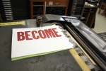
I used two different typefaces of antique wood type for this print.  The font I used for “BECOME” is a beautiful Helvetica-type font that belongs to my studio, and “WHO YOU ARE” is a condensed typeface from my personal collection (ala eBay).  I played around with alignment, and liked justified text the best.  Once I had the design figured out, I set “BECOME” in the pressbed and did the first run in red ink.  Then I reset the pressbed with “WHO YOU ARE” and did the second run in grey.

I’m very happy with the result!

Tagged , , , , , , , , , , ,

Great Video on the Letterpress Process

Etsy and I are friends on facebook (we go way back) and I just love getting status updates showcasing the artisans of Etsy, along with other fun goodies and information.  On Friday, I was delighted to see that they posted this amazing video by Naomie Ross that explains the letterpress process so quickly, artistically, and thoroughly.  So for everyone who I’ve tried to explain letterpress to by saying “you know, Gutenberg…movable type….blah blah” take a look at Naomie’s video and you’ll get a much better understanding of what I do.  She even uses the same press that I use at Pyramid!

And now I’m more convinced than ever that I need a Canon 7D.  HD video?  Awesome.

Tagged , , , , , , ,

Letterpress Wedding Invitation Checklist: Pre-press

I was so excited when my brother and his fiance asked that I design and print their wedding invitations.  It means so much to me that they want me to play such an important role in their special day, and I know that I’ll always cherish the memory (and prints)!  Letterpress wedding invitations is a field that I’ve been dying to get into, but just needed that extra push, and they were gracious enough to give it to me.

So my almost-sister-in-law and I have started meeting and planning the invites, and I have to say, I’m even more excited than before!  This will definitely be a learning experience for me, so here’s a pre-press checklist that is helping me organize my thoughts:

  1. Decide on colors.  The bride and groom are having a fall wedding, so they’ve opted for a deep purple with a slightly bluish undertone.  We matched the swatch from her bridesmaid dress to my  PANTONE Formula Guide, and found a very close match.  We agreed that black ink for the body text, and purple for the frame, names and flourish would make for a smart-looking invite.  However, as I started mocking up designs, I realized that once I go to print, the dark purple and black inks will be very close in pigment.  I racked my brain deciding how to amend the situation and ultimately decided there are two options.  First, we could stick with the dark purple and lighten the black ink to more of a gray, or keep the black text and use a slightly lighter purple.  The bride and I discussed, and she decided to keep the black ink, and use a lighter shade of purple that will provide more contrast.  I think she’s made a great decision!
  2. Decide which printing method works best.  I gave my future sis a little introduction to letterpress, and explained the methods we have at our disposal for the invitation design.  First and foremost, there’s wood/lead type.  We decided not to go with this option because I don’t have the largest type collection, and it really limits design options.  Secondly, there’s photopolymer plates.  While I like the versatility of photopolymer, they don’t always cooperate with me on the Vandercook, and hate that you can only really use them a few times before they’re morphed and no longer sticky.  The last option is magnesium dies.  We opted to go with these, as not only do they print beautifully, but they provide the opportunity for any type or layout that I can conceive, and then are adorable takeaways for the couple after the invites are complete.
  3. Assess the couple’s style.  The couple is having a formal wedding,  their style is timeless and traditional.  The bride-to-be wanted an invitation design that suited both parties within the couple, I really respect that.  In so many words, she asked that there be no florals, no hearts, and nothing too girly.  She found some great calligraphic corner flourishes that I used as inspiration, and I started the design process.
  4. Number of inserts.  When it’s all said and done, there will be four prints within the wedding invitation.  1) The invitation itself 2) RSVP card/envelope 3) directions, and 4) reception card.
  5. Paper!  I hear it a lot, people want to know why letterpress is so expensive!  Well, there are a few factors, and paper is one of them.  If you ask me (or most printers) 100% cotton paper is the only way to print letterpress and that comes at a bit of a price.  My future sis said that she wants paper that isn’t exactly white, but not super off-white.  I ordered some samples of Crane’s Lettra in Ecru, we’ll see if that fits the bill.
  6. Typefaces!  Since we’re going with a magnesium die, the bride has the option of using any of the thousands of fonts that I have on my computer.  So far we’re making great progress, she is in love with Edwardian Script as the script font, and now we just need to decide on the body font.
  7. Presentation.  The bride expressed interest in pocket folders to house the invitations.  At first I thought “oh, I can totally cut and assemble these myself!”  But the more I realized what an undertaking that would be, I turned to mygatsby.com.  I’ve ordered samples of some of their pocket fold designs so that we can see which layout she likes best, which will then help me design the printing plates since I’ll know that space that I’m working with.  I also ordered a sample swatch pack to see which colors would work best with the purple.  I’m really excited about this part.  I’ll be designing the RSVP, Directions and Reception cards in varying heights so that they are staggered within the pocket.  I’m telling you, it’s gonna look awesome!
  8. Envelopes.  We’ll get into these a bit later in the process once the bride has decided on a pocket fold, and thus, the invitation size.  We’re thinking the best option for printing guests addresses on the outer envelope is Kinko’s or another print shop, using mail-merge.  There’s just no way that I can print every single guests’ name on my trusty old press!

I think that sums up the progress we’ve made in the past two weeks!  I’ll be back with more checklists as we progress through the ridiculously exciting process of letterpress wedding invitations!

Tagged , , , , , , , , , , , , , ,

Hawaii Surf Photos!

I love photography, there’s no doubt about that.  But the jury’s still out on how I feel about editing photos.  On one hand, I love the flexibility and control that Photoshop and Lightroom allow after the fact, but as one trained in film photography, there will always be a small part of me that wonders if I’m cheating.  And then there’s the commitment!  I almost inevitably put off editing for weeks, and sometimes months.  It’s not that I’m not excited about my shots, it’s that the task of editing dozens, hundreds or even thousands of photographs is extremely daunting…especially when the weather is finally nice outside and my dog is looking at me longingly, begging to play.

My boyfriend and I took an amazing trip to Oahu, Hawaii in February.  We’re both amateur surfers, but seeing the peeps out on the North Shore shredding the waves was absolutely awe-inspiring.  We sat for hours watching these athletes navigate the waves, taking shots in between taking it all in.  We’ve been back for oh, you know, 2 months now, and I finally got around to editing some of my photos.  I’m sending them off to Adorama and MPIX tonight for prints to add to my etsy shop, but here’s a taste!

Tagged , , , , , , , , , , , , , ,